
.jpg)
Creating a psychrometric diagram at the beginning of projects allows for HVAC proposals that improve the thermal comfort of the building without introducing additional costs to the overall project cost.
Such measures include strategies such as insulation, cross ventilation, dynamic solar shading, adiabatic cooling, among many others. These measures are cost-effective, both in terms of construction and building use, as they make it possible to dispense with mechanical ventilation systems for more hours of the year.
A psychrometric diagram provides us with information about the temperature and humidity of a place and how occupant comfort in a building can be improved with passive strategies.
What is a psychrometric chart?
A psychrometric chart is a representation of the different processes that occur when the air changes state. This allows obtaining information about the temperature and humidity of the air at a given moment and seeing what processes can be applied to modify these parameters. Although they may seem difficult to understand at first, by learning how they work, they can be used to interpret the comfort of the occupants of a building and the effective design strategies to improve these conditions.
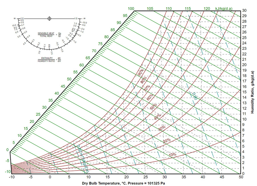
In the graphs, physical and thermodynamic properties are represented, such as dry bulb temperature (ambient temperature), wet bulb temperature (temperature due to evaporation), relative humidity in the environment, enthalpy, and air density.
In what way can a psychrometric chart be used?
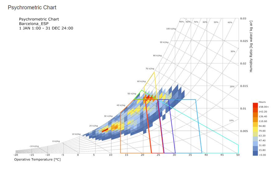
A psychrometric chart can be used in two different ways. The first is by plotting multiple data points on the graph that represent the air conditions at a specific moment. Then, overlaying an area that identifies the "comfort zone", which is the range within which the occupants of a building will be comfortable with the thermal conditions of the site. After these two steps, it is possible to analyse how to expand the comfort zone and what design strategies to use to achieve it.
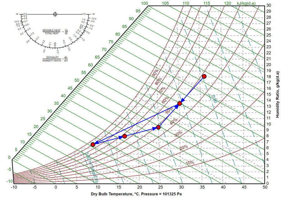
Also, mechanical engineers often use a psychrometric diagram to dynamically mark points that represent the conditions of the outdoor air and understand the process through which the air must circulate to reach comfortable thermal conditions for the occupants of a building. The data points move around the chart when used for that purpose.
The climate on a psychrometric chart
In a psychrometric diagram, the climate data are represented in three different variables:
- Dry bulb temperatures: i.e. the ambient temperature. These are marked on the graph with vertical lines. The air temperature increases from left to right.
- Wet bulb temperatures: i.e. the temperature due to evaporation and which is related to the thermal sensation. In the graph, these are marked with diagonal lines and, like the previous ones, the temperature increases from left to right.
- Relative humidity: these lines are marked in a curved manner and start at 100% at the top of the chart and decrease as they move downward. Generally, these lines are indicated in intervals of ten.
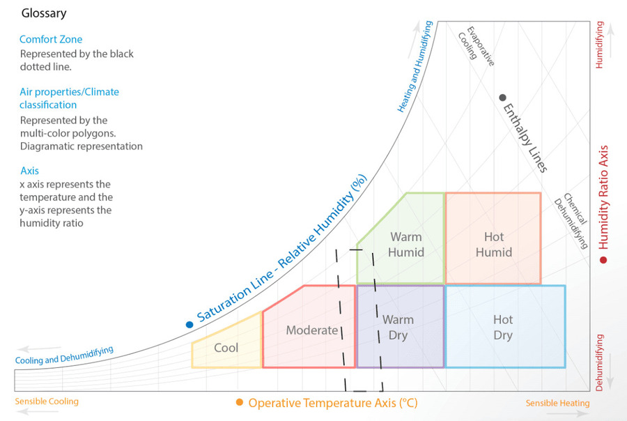
Comfort temperatures represented on a psychrometric chart
To express what the comfort zones would be, these are usually shaded on the psychrometric chart. It will vary according to the climate and the project in question. Using software or manually by a designer, the comfort zone is filled in based on the activity that will take place in the building and the expected level of clothing to be worn by the occupants.
What building design strategies can be proposed on the diagram?
The sustainable design strategies to improve the comfort of the occupants of buildings can be analysed and defined on the basis of climate data.
When data points are located to the right of the comfort zone, it is ideal to reduce the air temperature. An example of a strategy, in this case, would be to increase air circulation through natural ventilation. On the other hand, when the data points fall on the left side of the comfort zone, increasing the temperature would be advisable. Generally, to achieve this passively, solar collection systems with high thermal mass materials are incorporated.
When the relative humidity is very low, it can be increased through evaporative cooling. And, conversely, when it is very high, it can be reduced using desiccants.
The feasibility of the proposed strategies can be seen in the graph through how the percentage of comfort that the occupants of a building would have increases or decreases when applying (or not) these strategies.
A psychrometric diagram is an excellent tool that is not often used, but can be used to optimise the design of buildings at the preliminary design phase. Not only does it perform an analysis of the thermal comfort of buildings from a bioclimatic point of view, but it also allows for the inclusion of improvements when they still have a very low economic impact. Thanks to the preliminary design evaluation tools and the available climate data, these measures can be easily studied in all projects and thus propose the ideal strategies for making improvements.
